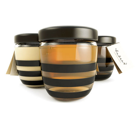
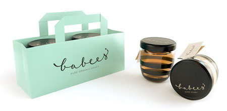
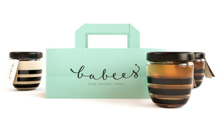
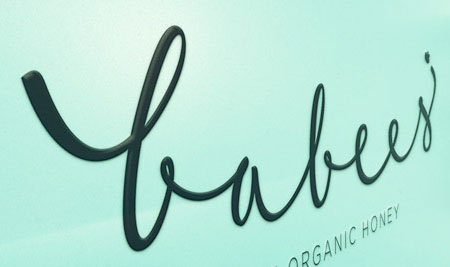
Beautiful packaging for honey, isn’t it? It is designed to encourage kids to reach for this honey instead of refined sugar. Pretty clever, kids tend to grab more interesting stuff instead of ordinary stuff. The designer tried to treat this honey jar as a playground for a character design, you can tell from the dark cap and stripes. The logo is hand calligraphed, custom made, and softens the overall look. Beautiful doesn’t have to be complicated.


From : Ah&Oh Design Studio via [LovelyPackage]

 Logging you in...
 Loading IntenseDebate Comments...